
Shopping online has become the convenient way to find the best deals, ship items to your home and locate the perfect gift. You can research products and look up inspirations before purchasing from your favorite sites. All of this can be done from the comfort of your home. But sometimes navigating shopping sites can be frustrating; and if not designed well, will cause you to leave the site before purchasing.
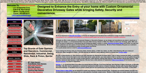
I did a search for worst designed sites in 2018. The search results included many sites that were hard to view and/or navigate. The one that gave me the biggest headache was Gates N Fences. There was way too much content on the page; the layout of the images against the content over powered the page. The fonts were hard to read on the navigation panel, and the use of many colors was distracting. There were several sub navigations throughout, as well as, links within the content. No overall structure was evident, and just a ton of content placed on the site.
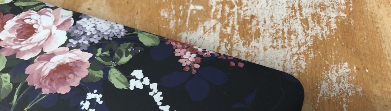
One site that I often go to for home shopping and inspiration is Pottery Barn. I find the site to have an open clean design, with easy navigation, and it is constantly updated with inspirations according to the season. The colors are neutral, which keeps my attention on the products I am looking at; and the photography is beautifully done to provide easy-to-do design inspiration for the clueless home designers like myself.

Sites that are designed well lead to a better user experience. With clear easy to navigate shopping, the user will spend more time and ultimately purchase a product. Inspirations sprinkled throughout a site will increase purchasing volume; and lead the user to return for more ideas whether it’s for design, clothes or home electronics. You want to have a site that will encourage return use and keep the interest of the shopper. The longer they remain on the site, the more likely they are to purchase.
